Learn how to create impactful Salesforce Dashboards in Analytics Studio with this comprehensive guide. From data connections to advanced widgets, master the art of designing interactive dashboards that drive business insights and improve decision-making.
Salesforce Dashboards give companies an unprecedented ability to turn raw data into actionable information. If you are a Salesforce admin, a data analyst, or a business user, becoming a pro at dashboards in Analytics Studio is key to unlocking the value of your data. In the modern business landscape, data is only as good as your ability to interpret it. We are drowning in numbers, but starving for insights.
This comprehensive guide will show you how to build your own Salesforce Dashboards in Analytics Studio, step by step. From grasping the complex interface to sharing your completed dashboards with both your team and your stakeholders, you will see for yourself how you can take the company’s data and turn it into easily showcased, interactive dashboards designed just for your business.
At the end of this post, not only will you know how to create beautiful Salesforce Dashboards, but you will also know some best practices to ensure impact and usability. We will even discuss how this compares to other setups in the analytics ecosystem, ensuring Salesforce Dashboards remain at the heart of your business intelligence strategy.
The Role of Salesforce Dashboards in Business Success
Salesforce Dashboards are more than pretty charts on a screen. As the single source of truth, they become the headquarters for analytics-informed decision-making at a team level. Users have immediate access to timely insights in KPIs and receive less noise through thoughtfully designed visuals, as well as make informed decisions in a short time frame.
In many organizations, data silos prevent teams from seeing the full picture. Marketing might look at web traffic while Sales looks at closed deals, and never the twain shall meet. Salesforce Dashboards bridge this gap. Analytics Studio dashboards take this to the next level by offering interactive, live reports instead of static images. Through functions such as intelligent widgets and filters, users can access their data in customizable ways.
Why this matters significantly for your enterprise:
- Improved decision-making: Salesforce Dashboards present complex data in a digestible format. Instead of staring at a spreadsheet with 10,000 rows, an executive can see a trend line moving up or down.
- Collaboration: Teams can align goals and track progress across departments. When everyone looks at the same Salesforce Dashboards, everyone is on the same page regarding what “success” looks like.
- Time savings: Automated and real-time visuals reduce manual reporting time. No more spending Friday afternoons copying and pasting cells into PowerPoint.
- Predictive Analysis: Advanced Salesforce Dashboards can help forecast future trends based on historical data, much like how one might analyze traffic trends when using Salesforce Dashboards.
Now, let’s jump into how to set these dashboards up!
Step 1: Understanding the Analytics Studio Interface
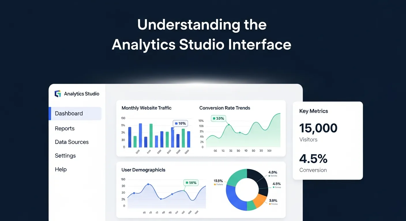
Before building a dashboard, it’s important to familiarize yourself with the Analytics Studio interface within Salesforce. Analytics Studio is part of the Salesforce CRM Analytics platform (formerly known as Tableau CRM), so if you already have access to Salesforce, chances are you can jump in today.
The interface can be daunting at first glance. It is far more robust than the standard Salesforce reporting tab. It allows for complex data manipulation, showcasing the level of detail and control you can achieve with Salesforce Dashboards, especially for advanced tracking and analytics needs.
Key areas to note in Analytics Studio:
- App Launcher: Access various applications, including “Analytics.” This is your gateway. You will find it in the waffle icon at the top left of your Salesforce screen.
- Home Screen: Your starting point for recent dashboards, datasets, and notifications. This personalized view helps you jump right back into your most critical work.
- Dashboards Tab: Where all your created Salesforce Dashboards live. You can organize these into folders or “Apps” to keep different departments’ data separate.
- Datasets Tab: Houses your imported or existing datasets that fuel dashboards. This is the engine room. Without datasets, your dashboard is just an empty shell.
- Data Manager: This is often a separate tab where you monitor data flows and recipes. It ensures that the data feeding your Salesforce Dashboards is fresh.
- Edit Mode vs View Mode: Edit Mode is for creating and changing dashboards, while View Mode allows interaction without altering configuration. It is crucial to know which mode you are in to avoid accidental deletions.
Pro Tip: Experiment with the “Demo Org” or a “Sandbox” environment to explore dashboard building without affecting live data. This allows you to fail safely and learn the ropes of Salesforce Dashboards without fear.
Step 2: Connecting to Data Sources
Every Salesforce dashboard starts with data. Analytics Studio lets you connect to multiple data sources depending on your use case. This flexibility is what makes Salesforce Dashboards superior to many standalone tools. You are not limited to just CRM data; you can ingest external data to create a 360-view of your business.
Common data sources include:
- Salesforce Objects: These are your standard tables, such as Accounts, Opportunities, Leads, Cases, and Custom Objects.
- CSV or Excel files: For importing external data that might not live in a cloud system yet.
- External databases: You can connect via APIs or data connectors to AWS, Google BigQuery, or even on-premise SQL servers.
- Marketing Data: Integrating data from your website is crucial. While some use Salesforce Dashboards setups for web data, bringing that data into Salesforce creates a unified view.
How to connect data in Analytics Studio:
- Navigate to “Datasets” in the sidebar or open the “Data Manager.”
- Click “Create”, then select the source type (e.g., Salesforce Data, External File).
- Define your data schema and map fields appropriately to ensure compatibility. You need to tell Salesforce which column is a “Date” and which is a “Number.”
- Save the dataset and test its structure by previewing the data. Always preview!
Ensure that your data is clean and well-structured before importing it. Errors or inconsistencies at this stage can affect dashboard results. If you have duplicate records or missing fields, your Salesforce Dashboards will tell a misleading story. This is similar to the precision required when mapping events in Salesforce Dashboards integration; bad data in equals bad insights out.
Step 3: Designing Your Dashboard Layout
Layout design is one of the most exciting (and important) aspects of creating a Salesforce dashboard. Your layout dictates how users interact with and interpret data. A poorly designed dashboard leads to confusion and low adoption rates. You want your Salesforce Dashboards to tell a story, reading from left to right, top to bottom.
Tips for an effective layout:
- Start with a Blueprint: Sketch the basic sections of your dashboard on a piece of paper. Define where headers, sidebars, and main visualizations will go.
- Group by Relevance: Place related information together for easier navigation. For example, keep all “Revenue” metrics in one zone and “Activity” metrics in another.
- Follow Visual Hierarchy: Larger or highlighted elements should grab attention first. Your most important KPI (like Total Sales) should be big and at the top.
- Whitespace is your friend: Do not clutter the screen. Leave empty space between widgets so the eye can rest.
How to do it:
- Open Analytics Studio’s “Create Dashboard” function.
- Choose a template. You can start with a “Blank Canvas” for total freedom or use a “KPI-focused layout” to save time.
- Drag-and-drop containers. Containers hold your widgets and keep them aligned.
- Adjust the grid. The grid editor allows you to snap items into place, ensuring pixel-perfect alignment for professional-looking Salesforce Dashboards.
Step 4: Adding and Configuring Widgets
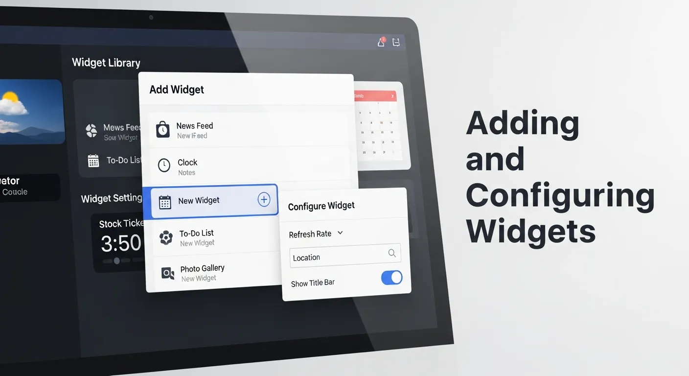
Widgets are the building blocks of Salesforce Dashboards. With widgets, you can translate raw data into visual elements like charts, tables, or KPIs (key performance indicators). The power of Analytics Studio lies in the variety of widgets available.
Popular widget types:
- Bar charts: Excellent for comparing metrics like monthly sales revenue or lead sources.
- Pie/Donut charts: Use these sparingly to showcase percentage breakdowns, such as Opportunity Stage distribution.
- Tables: sometimes you just need the details. Tables display detailed numbers for specific items (e.g., customer details).
- Number Widgets: These are your big, bold numbers for highlighting key values, such as Closed Deals or Total Pipeline.
- Maps: If you have geographic data, maps are a fantastic way to visualize territory performance.
How to configure widgets:
- Click “Add Widget” in the dashboard editor (or drag a chart icon onto the canvas).
- Select your widget type and specify the dataset it should pull from.
- Enter the “Lens” mode to query your data. Here, you select your measures (Sum of Amount) and groupings (Group by Industry).
- Customize the appearance. Adjust colors to match your company branding. Change font sizes for readability.
- Set sorting. Do you want to see the highest value first?
- Apply conditional formatting. For example, make the number turn green if it hits the target, or red if it is below.
Preview each widget as you build to ensure correct formatting and data alignment. Just like checking your tags when setting up Salesforce Dashboards, you must verify that your Salesforce Dashboards are pulling the right numbers.
Step 5: Applying Filters and Interactions
Filters and interactions turn static dashboards into powerful tools for exploration. They allow users to drill deeper into data with just a click. Without filters, a dashboard is just a poster. With filters, it becomes an application.
Common filter examples:
- Date filters: Essential for tracking performance over a specific timeframe (This Quarter, Last Year, Year to Date).
- Region filters: Allow regional managers to focus on their specific geographic data.
- Category filters: Filter by industry type, product category, or Lead Source.
- Owner filters: Let sales reps filter the dashboard to see only their own numbers.
How to add filters:
- Add a “List Widget” or “Date Widget” to the top of your dashboard (often called the “Filter Panel”).
- Map the filter to dataset fields (e.g., “Region” or “Close Date”).
- Faceting: By default, Analytics Studio enables “faceting.” This means if you click a bar in a chart (e.g., “Tech Industry”), all other charts on the dashboard will filter to show only Tech Industry data.
- Bindings (Advanced): For complex interactions, you can use bindings to dynamically change measures or groups based on user selection.
By properly setting up filters, your dashboard becomes more interactive and actionable. This interactivity is a key advantage of Salesforce Dashboards over static exports or basic Salesforce Dashboards reports.
Step 6: Best Practices for Dashboard Design
To ensure your Salesforce Dashboards are as effective as possible, follow these best practices. A dashboard that no one uses is a failure, regardless of how complex the query is behind it.
- Clarity First: Simplified, clean visuals communicate better than cluttered designs. Avoid overloading the viewer with too many charts on one page.
- Consistency: Use consistent colors. If “North Region” is blue in one chart, it should be blue in all charts. Use consistent fonts and labels.
- Measure What Matters: Focus on KPIs and metrics that align with your business goals. Don’t include a metric just because you have the data.
- Optimize Performance: Avoid using too many heavy datasets or complex queries (SAQL) that run simultaneously, as this can slow dashboard load times.
- A/B Test Dashboards: Share versions with different layouts or visualizations to find what resonates with your users.
- Mobile Optimization: Ensure your Salesforce Dashboards look good on mobile devices or tablets for executives on the go.
Integrating Email Marketing Data into Salesforce
One of the most powerful ways to enhance your Salesforce Dashboards is by integrating inbound email marketing data. While Salesforce is great for sales data, marketing data often lives in silos. Bringing email metrics into your dashboard allows you to correlate marketing efforts with closed revenue.
When you track inbound emails, you can analyze response times, sentiment, and volume directly within Analytics Studio. This helps align sales and marketing teams. For example, you can visualize how many inbound leads from a specific email campaign turned into Opportunities.
- Metric 1: Response Rate. How fast are reps replying to inbound inquiries?
- Metric 2: Conversion by Campaign. Which email subject lines drove the most revenue?
- Metric 3: Volume Trends. What times of day do we receive the most inbound emails?
To learn more about optimizing your inbound email strategy, you can visit this resource: Salesforce Marketing works on inbound emails.
Key Email Metrics for Salesforce Dashboards
|
Metric Name |
Description |
Why it matters |
|---|---|---|
|
Open Rate |
Percentage of recipients who opened the email. |
Indicates subject line effectiveness. |
|
Click-Through Rate |
The percentage who clicked a link. |
Shows content engagement. |
|
Lead Velocity |
The speed at which a lead moves from “Email Received” to “Qualified”. |
Critical for pipeline health. |
|
Attributed Revenue |
Dollar value of deals sourced from email campaigns. |
Proves the ROI of email marketing. |
Comparing Analytics Platforms: Salesforce vs. Web Tools
When discussing data visualization, the conversation often turns to platform comparison. A common point of confusion for businesses is understanding when to use CRM analytics versus web analytics. Specifically, many marketers are familiar with the process of connecting Google Analytics to WordPress to track website hits, bounce rates, and page views.
However, Salesforce Dashboards serve a different purpose. While a Salesforce Dashboards setup is excellent for anonymous top-of-funnel traffic analysis, Salesforce excels at bottom-of-funnel, identified customer data. The magic happens when you bring them together. By importing web data into Analytics Studio, you can see not just that a user visited your pricing page, but which specific Account that user belongs to.
Points of Distinction:
- Identity: Google Analytics to WordPress is largely anonymous; Salesforce is identified.
- Scope: Web tools track sessions; Salesforce tracks relationships.
- Actionability: Salesforce Dashboards allow you to assign tasks based on data; web analytics usually do not.
For deeper insights into mastering web analytics strategies, check this guide: Mastering Google Analytics for marketing success.
Salesforce Analytics vs. Web Analytics
|
Feature |
Salesforce Dashboards |
Google Analytics (Web) |
|---|---|---|
|
Primary Data Source |
CRM (Accounts, Deals) |
Website (Hits, Events) |
|
User Identification |
High (Specific Contacts) |
Low (Anonymous/Aggregated) |
|
Customization |
Extremely High (SAQL, Custom Code) |
Moderate (Standard Reports) |
|
Integration Goal |
Revenue & Pipeline Management |
Traffic & User Acquisition |
The Affiliate Angle and WordPress Integrations
For businesses that rely on affiliate marketing, integrating this data into Salesforce Dashboards is a game-changer. Often, affiliate data lives in WordPress plugins or external networks. If you are running a content site, you likely use specific plugins to manage these links. Similar to Salesforce Dashboards workflows, you can push affiliate conversion data into Salesforce to pay out commissions accurately or track partner performance.
Imagine a dashboard that lists your top 10 affiliates by revenue generated, updated in real-time. This requires a bridge between your CMS (like WordPress) and Salesforce. By visualizing this data, you can identify which partners are driving high-quality leads versus those who are just sending volume with low conversion.
Key Integration Benefits:
- Unified Payouts: Calculate commissions based on closed-won opportunities, not just clicks.
- Partner Scoring: Rank partners based on lead quality.
- Fraud Detection: Spot anomalies in traffic sources.
If you are looking for the best tools to manage this on your site, read this review: Best Affiliate Marketing plugins for WordPress.
Affiliate Data Points for Salesforce
|
Data Point |
Definition |
Dashboard Visualization |
|---|---|---|
|
Referrer Source |
Where the user came from. |
Donut Chart by Source |
|
Conversion Value |
The revenue generated by the affiliate. |
Number Widget (Currency) |
|
Lead Quality Score |
Automated score of the lead’s potential. |
Bar Chart (Avg Score by Affiliate) |
|
Payout Status |
Whether the commission has been paid. |
Toggle/Filter List |
Step 7: Sharing and Collaboration

Now that your dashboard is complete, it’s time to share it with stakeholders! Salesforce makes sharing seamless so your team can work collaboratively. A dashboard hidden in a private folder drives no business value.
How to share:
- App Access: Ensure the users have access to the “App” (folder) where the dashboard is saved. You can grant “Viewer”, “Editor”, or “Manager” access.
- Direct Links: Click the “Share” icon to generate a direct link. You can email this link to a colleague.
- Embedded Dashboards: Embed your Salesforce Dashboards directly into Salesforce Lightning pages. For example, embed an “Account Health” dashboard directly onto the Account Record page so sales reps see it every time they open a client file.
- Subscriptions: Schedule auto-email reports. You can set the dashboard to email a snapshot to the CEO every Monday morning at 8:00 AM.
- Download: You can download images or Excel files from the dashboard widgets for offline presentations.
Encourage collaboration by inviting feedback and suggestions from your team. This ensures that your dashboards remain user-friendly and impactful.
Wrap-Up: Start Creating Dashboards that Drive Business Insights
A good Salesforce dashboard can change the way you deal with data in your company. Whether you’re the one monitoring sales performance, exploring customer trends, or managing team performance, dashboards offer insights that are fundamental to making smarter business decisions.
It is a journey from raw data to refined intelligence. By mastering Analytics Studio, you move beyond simple reporting and into the realm of business intelligence. You bridge the gap between platforms, perhaps even drawing inspiration from how you connect Salesforce Dashboards, to create a unified data strategy.
Now it’s your turn! Follow these steps to build your first dashboard in Analytics Studio (and see what a difference it can make).
Need additional help to know “What is Sales Analytics and Why Does It Matter?” Salesforce’s documentation and online tutorials are excellent. Or, if you’re interested in learning faster, check out workshops from Salesforce-certified professionals.
Frequently Asked Questions (FAQ)
1. What is the difference between Salesforce Reports and Analytics Studio Dashboards?
Salesforce Reports are operational and great for real-time list views, like “Show me my open opportunities today.” Analytics Studio (CRM Analytics) is for strategic, historical, and trending analysis. It can process millions of rows of data much faster and allows for combining data from external sources, whereas standard reports are generally limited to Salesforce data only.
2. Can I combine data from different Salesforce orgs into one Dashboard?
Yes, Analytics Studio allows you to connect to multiple Salesforce orgs using the Salesforce External Connector. This is ideal for holding companies or businesses with multiple instances. You can pull the data into one central “Data Manager,” create a unified dataset, and visualize it in a single Master Dashboard.
3. How does Analytics Studio handle data security?
Analytics Studio inherits Salesforce sharing rules, but it also has its own security layer called “Security Predicates.” You can define row-level security so that a user logging in only sees the data they are permitted to see, such as their own region’s sales figures.
For more on data strategy, check: business analytics growth strategy.
4. Is it difficult to learn SAQL (Salesforce Analytics Query Language)?
For basic dashboards, you do not need to know SAQL. The drag-and-drop interface writes the queries for you. However, for advanced logic, custom calculations, or complex bindings, learning SAQL is beneficial. It is similar to SQL but optimized for the Salesforce Analytics Cloud structure.
5. Can I view Salesforce Dashboards on my mobile phone?
Yes, Salesforce has a dedicated “Analytics” mobile app available for iOS and Android. The dashboards are responsive, but it is best practice to create specific “Mobile Layouts” within the dashboard editor to ensure that charts are stacked correctly and readable on smaller screens.
6. How often does the data in the dashboard refresh?
Data in Analytics Studio is not “live” in the same way a standard report is; it relies on dataflows or recipes that run on a schedule. Typically, these run once a day or every few hours. You can schedule these dataflows to run as frequently as every 15 minutes, depending on your license type.
To understand the power of data experience, read: The power of analytical experience.
7. What happens if I delete a dataset used in a dashboard?
If you delete a dataset, any widget on your Salesforce Dashboards that relies on that dataset will break and display an error message. Analytics Studio usually warns you if a dataset is in use before allowing deletion. It is best practice to check dependencies before removing any data assets.
8. Can I export data from a dashboard widget?
Yes, users with the correct permissions can click the dropdown arrow on any widget and select “Share” or “Export.” They can download the underlying data as a CSV or Excel file. This is useful for finance teams who want to perform further ad-hoc analysis in spreadsheets.
9. How does this compare to connecting Google Analytics to WordPress?
Connecting Salesforce Dashboards is primarily for tracking known customer data and analyzing business processes. While Salesforce Dashboards are designed to provide deep insights into different phases of the customer journey, they are essential for a complete and unified view of business health.
10. What is a “Recipe” in Salesforce Data Manager?
A Recipe is a user-friendly way to clean and combine data. It allows you to join different datasets, filter rows, transform fields, and create calculated columns using a visual interface rather than code. It is the primary tool for preparing your data before it hits the dashboard.
For a scientific perspective on analysis, visit: What is analytical chemistry?